Monday, 19 August 2013

Moody Interiors


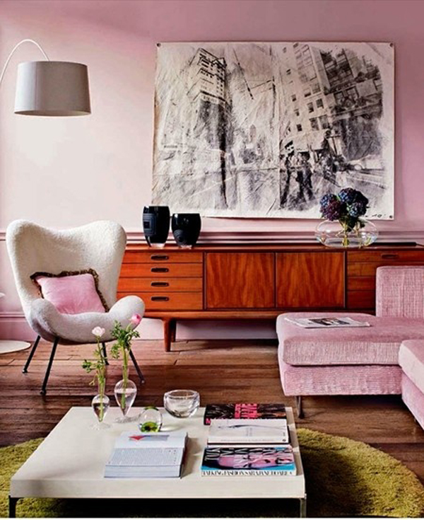
We have noticed a trend in Interiors of late. There seems to be a shift towards a dark, moody style of decorating, moving away from the bright, white spaces that have been so dominant over recent years. While light-filled spaces will never be out of fashion, and we feel moody spaces will just be a trend that comes and eventually goes, it feels like quite a luxurious change that we are rather liking!

Dark, matte walls paired with deep chocolate or charcoal floors, mixed with metal and texture, then offset with a bold, bright colour seems to be the order of the day. The style has an opulence to it that seems to hush a room to subtleties in tone and texture that draws you in and invites you to snuggle down for a while.

Here are some examples of these dark, moody interiors we have discovered. What do you think? Will your home get a moody makeover?


[1 | 2 | 3 | 4 | 5]

Friday, 9 August 2013

New Design - Toucan


Meet the newest members of the Wallstudio family. They are colourful, a whole lot of fun and would love to hang out at your place! They are the new Toucan canvas designs and they are available now as part of our Welcome to The Tropics range in our store.

These colourful Toucans are sitting pretty on their perch with a bold chevron patterned background in seven fab colour combinations including orange and turquoise, fuchsia and green, and yellow and blue, to name a few.

The design is light-hearted, summery and will be a definitely talking point for any room!

To purchase your own Toucan friend head to the Wallstudio store.

Thursday, 25 July 2013

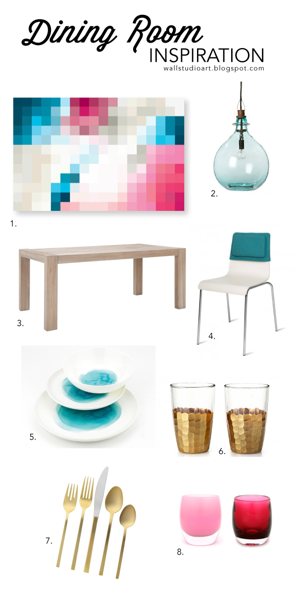
Pixelate Canvas Dining Room Inspiration

I [Amanda] absolutely love the new Pixelate canvas designs Janette has created. They are colourful, bold, fun and fresh. I felt inspired by the colours and the feel of this particular colour way and decided to make it the jumping-off point for creating an inspiration board for a vibrant dining room!

Taking my cue from the canvas, I have selected a mixture of objects that combine both formal and casual elements, a mixture of metals and a couple of shots of bright colour to bounce back the platte of the canvas.

I think the elements combine reinforce the idea of fun, bold and fresh and I know it is a space I would love to not only entertain in, but dine in every day!


Friday, 12 July 2013

Pinterest Picks - Pretty in Pink

Here at Wallstudio we LOVE Pinterest, in fact you could go as far as to say we are a little obsessed! Today we thought we would share some of the fabulous things we found on Pinterest this week - all pretty in pink. We love them and we hope you do too!

Are you on Pinterest? Why don't you follow us @Wallstudioart!?


Happy Pinning!

Monday, 8 July 2013

Designer Profile - Modern Home Magazine


We are super excited to share with you that Janette and Wallstudio have been featured in the Designer Profile of the current Modern Home Magazine! Head to your local Newsagent to pick up your copy and read the full interview!


Thursday, 27 June 2013

New Design: Pixelate


Janette has been hard at work, again, creating a fabulous new design to the Wallstudio Abstract Collection. The new design is called Pixelate and is available in 3 colour ways. The design is made of of many squares of colour to give the impression of a pixelated image that has been zoomed too far in on. The abstract design allows the viewer's imagination to take over and the bold, bright colours are happy and work well with any contemporary space.

We hope you love the new Pixelate designs as much as we do!

Order your canvas online now!


Thursday, 20 June 2013

Low Hung Art


Generally we tend to hang our wall art at eye level, right? It makes sense and it just tends to be the way everyone does it. Of course, there is more than one way to do most things, and hanging art is no different.

Back in past eras whole walls were often filled with art from crown moulding to skirting boards and while I don't think this look will hit the main-stream again, many design conscious home owners are playing with the placement of their art. Today, let's look at low hung art.


Hanging art on the lower half of a wall adds interest and intrigue. It forces the viewers eye downward, which can change the perception of the room's dimensions, and it also draws in one's attention. It is a clever tool to use for directing the eye around a space and creating interesting points of refuge too.


So when thinking about hanging art in your space, why not consider placing it low on a wall, or even propping it up on the floor, for a unique and interesting display!?

[images 1 | 2 | 3 | 4 | 5]